| browse projects: | prev | | | next |
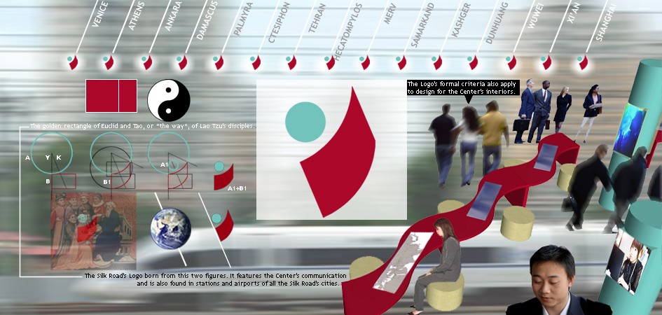
We propose a "Silk Road" logo, whose semantic and formal references also apply to set up Centers. We were inspired by two schools of thought that developed at the two poles of the Road: the Euclidean for the west and the Taoist for the east. The circle “A” and the golden rectangle “B” have the areas in ratio 4:1, like Asia and Europe. The centre of “A” and the western side of “B” are on the axis “Y". From the centre of “A” to the golden point of “B” we can draw the axis “K”. “B” curves on “A” circumference to form the first part of the figure (B1). The second part of the figure (A1) is a circle, which have diameter and position determined by the golden ratio between the two figures on the “K” axis, and by its tangency with “Y” axis. The obtained figure (A1+B1) is colored red lacquer and turquoise, and rotated of 23 degrees, like Earth's axis. This Logo is a symbol both ancient and contemporary, that also evokes a “gesture”: a greeting, a gift, an exchange.